The longer I’ve been in tech, the more I recognize a fundamental truth; a person is only as good as your org structure and processes allow. It doesn’t matter if you have a team overflowing with “10x” whatevers if you’re only capable of utilizing 1x. That means if you really want to improve the quality of design, engineering, etc. the most impactful thing you can do is shape good processes and structures.
All of that is to say, when I see a Tweet like this, I take notice:
I spoke to Star Wars Jedi: Survivor director Stig Asmussen about how they made this excellent game in ~3 years, half the time of most modern development cycles, and how Respawn pivoted to allow anyone to work remotely
How did they do it? A line in the linked Bloomberg piece tells the story:
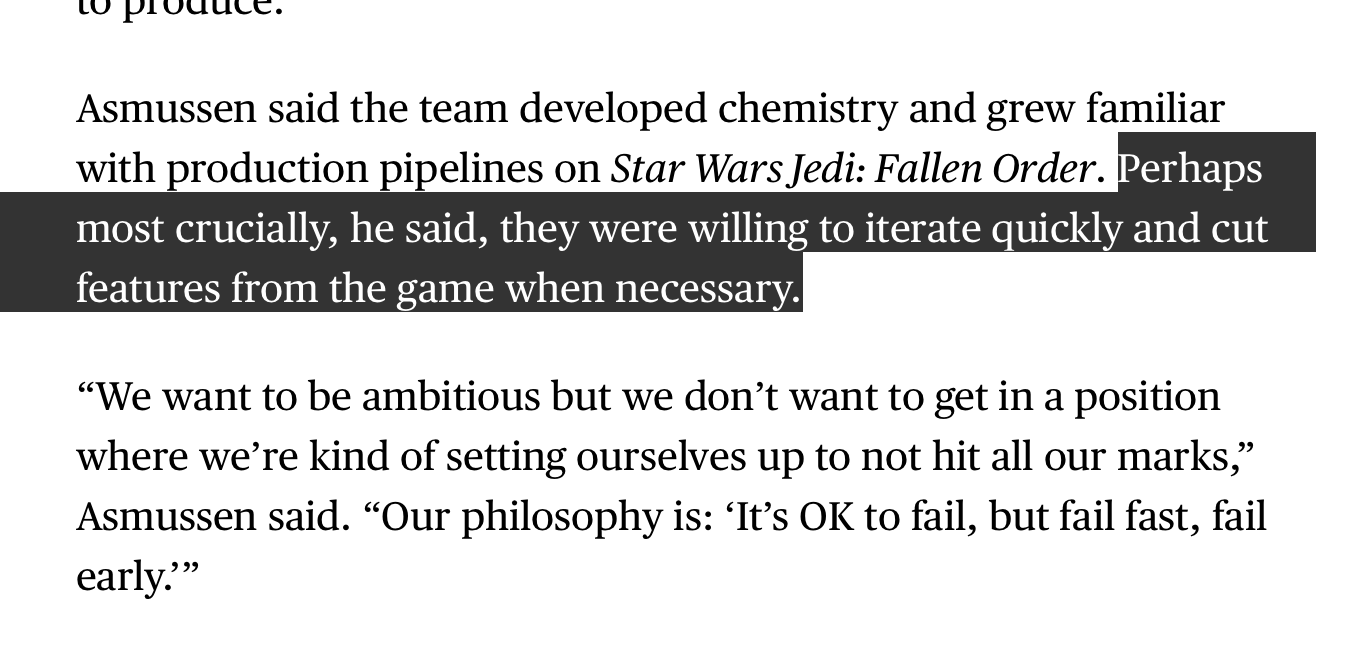
In large part due to the “teams of narrow specialists” approach that’s common in tech, software teams more often than not follow some flavor of Waterfall. Now, most don’t identify as such, but if you’re doing 100% of design work up front, handing down rigid specs, or generally in the business of tossing things over walls, you’re on the Waterfall train. And the Waterfall train moves very, very slowly.
Companies try to make the Waterfall train move faster by throwing bodies at it, but that works about as well as… throwing bodies at a moving train. If you want to ship better software faster, the surefire approach is to do what Stig and team did:
- Start building much sooner than later. There’s nothing like being able to use the thing and put it in front of others to let you know if you’re on solid ground. Working iteratively means you avoid building a very expensive house on a foundation of sand.
- Stay flexible. You don’t know what you don’t know until you start building. Rigid specs and requirements (“just implement the Figma file”) lead to solutions that takes weeks when they could have taken hours. Be like water, not like stone.
Here’s a practical example of those two principles in action, using a recent project we worked on here at Status Hero.
We needed to build a searchable multi-select field; we’d been relying on browser supplied multi-selects, and while they’re simple to implement, they’re ugly and totally unusable for anyone who doesn’t know the keyboard commands for selecting multiple options. We’re aiming for a higher quality bar, so they had to go.
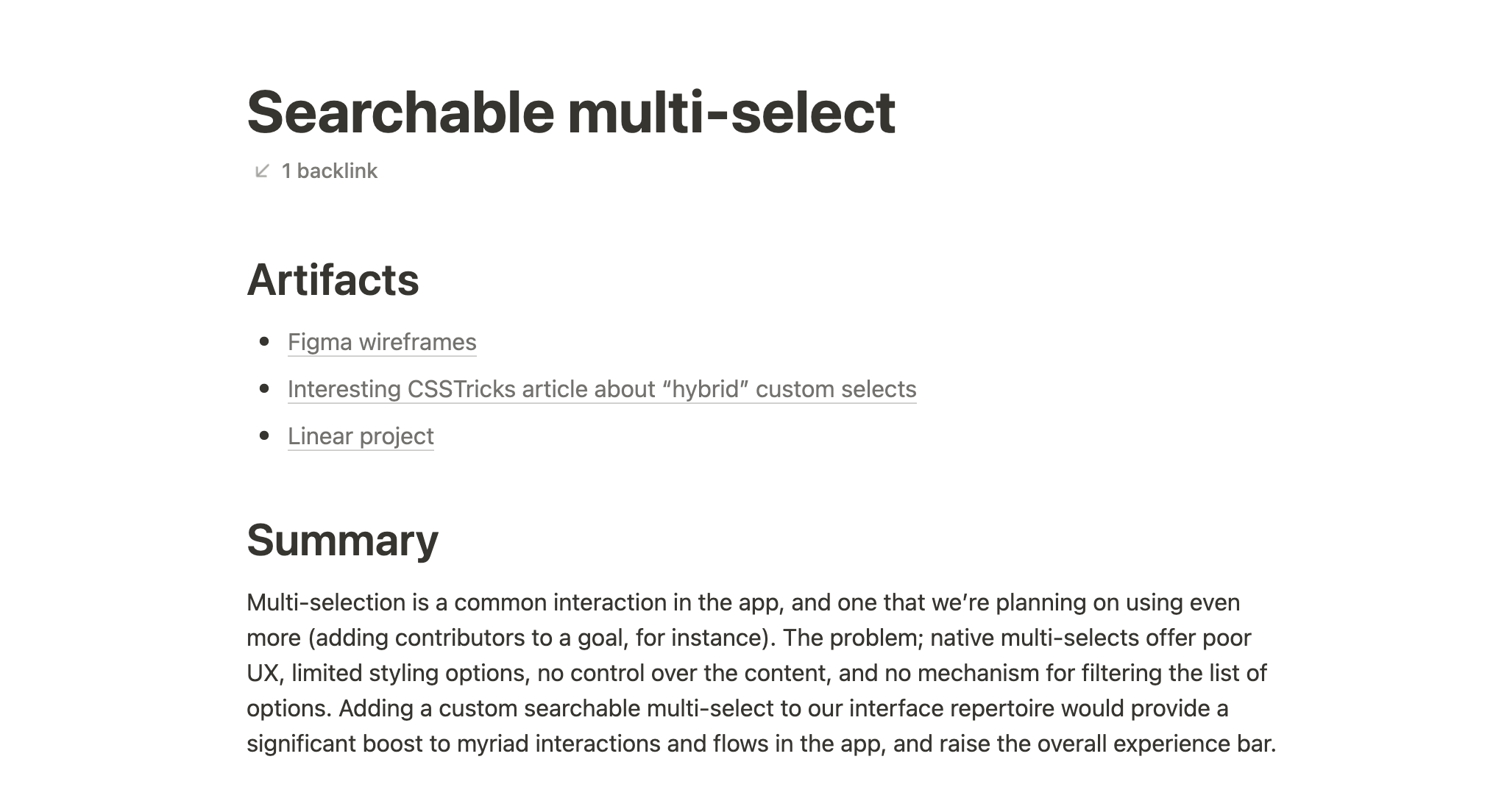
Step one was a quick design brief (depending on your background, “product brief” or “project brief” might fit your brain better). Our briefs are pretty flexible and intentionally low ceremony, but they always summarize why we’re doing this (super critical!) and link up artifacts like Figma files or technical docs so everything is in one easy-to-reference place:
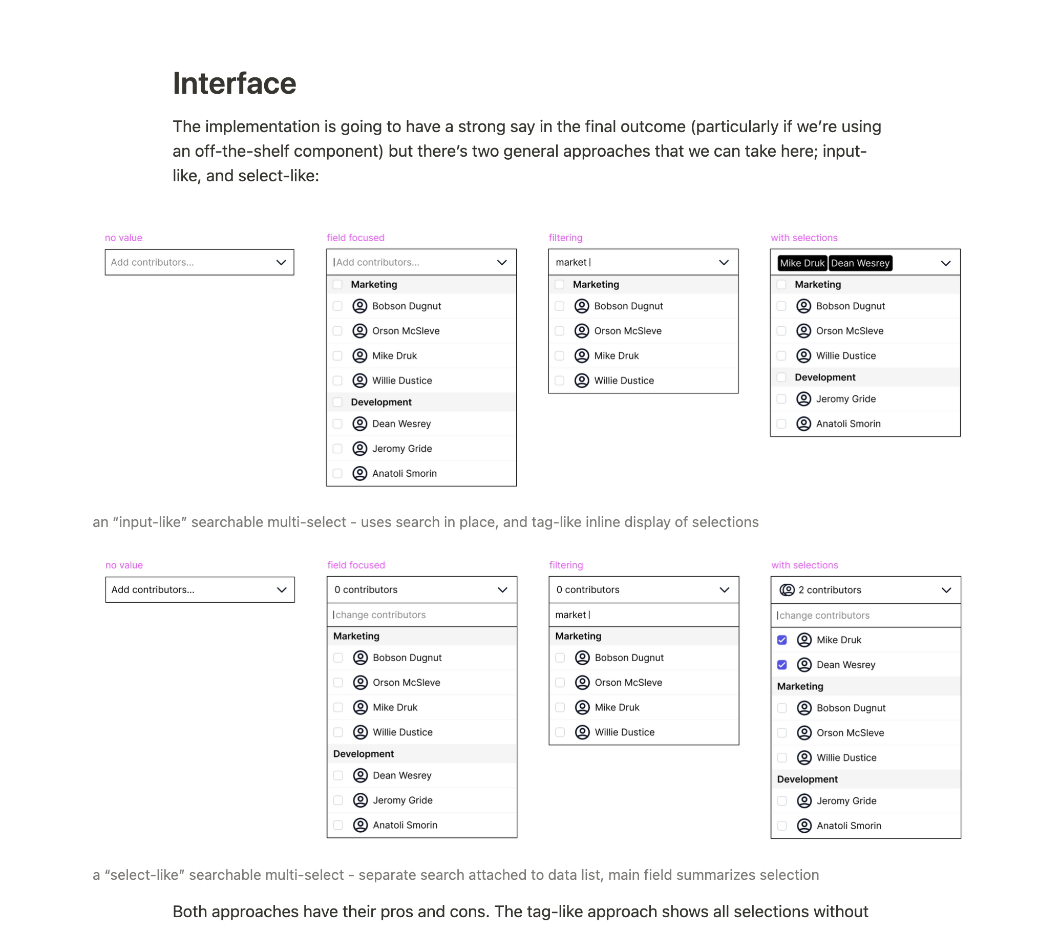
In this case I included a few quick wireframes of some potential solutions to help communicate the concept and provide something concrete that we could discuss:
Our design briefs also include summaries of the major scopes of work; the wireframes and design goals covered most of it in this case, so the scopes are pretty light:
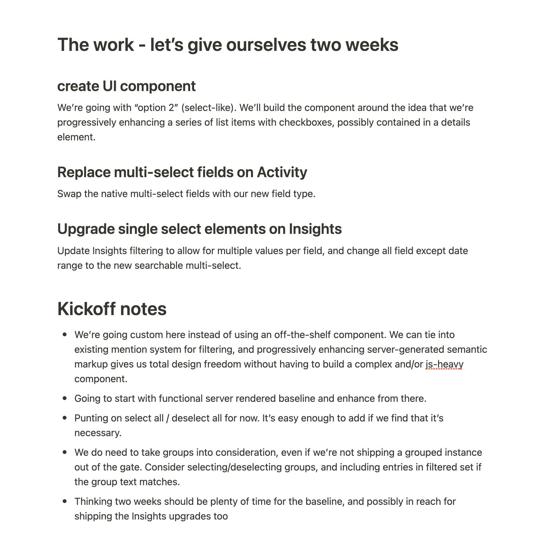
Next was a quick kick-off session with the developer on the project (Javan) and myself. We pulled up the brief, gave it a quick review, and started talking about the approach we want to take. We started the discussion from a “what’s a good progressively enhanced way to do this?” place, and quickly landed on an approach that closely resembles the “select-like” option. I updated the brief to include our notes from the kickoff. This is mostly for anyone else who’s interested in staying in the loop on progress.
From there, Javan spent a few days working on the raw functionality. Nothing polished at this point, just something that we could put our hands on and iterate on. After he pushed up his initial work, I stepped in to do the “finish carpentry”; taking the unpolished UI and slinging CSS until I was happy with how it looked and worked across the various states.
I passed it back to Javan, who tidied up the code and added our new component to all the spots in the app where we were using native multi selects. Then we both did some QA, and shipped.
Here’s what the final component looks like:
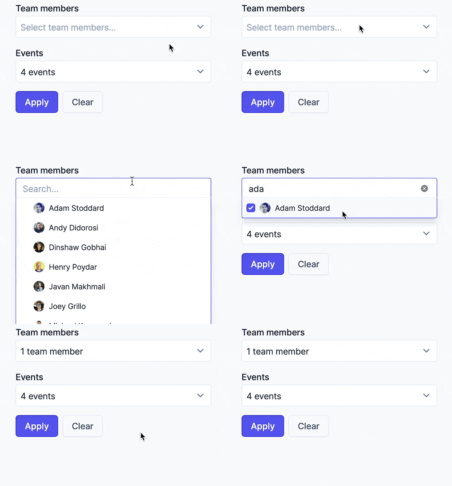
Total time; about a week. We cut adding option groups to get there, but we don’t need them yet. We’ll add them when we do, and by that time, we’ll have months of real-world usage from ourselves and customers to better inform the next iteration.

