Status Hero’s brand identity uses “found images”; vintage photos, public domain images from the NASA archives, dank memes, etc. From a production perspective it’s a big win, but it poses an interesting design challenge. How do you make images that cross decades, styles, and mediums into something that feels coherent?
Simple. When you can’t create uniformity at the source, you build a new uniformity layer on top; a “brand lens” that all those disparate assets are viewed through, making them look and feel like they’re all part of the same world.
There’s a million ways you can go about building one, but it’s important to establish some clear guiding rules. Remember, brand building is world building, and worlds have rules. Our brand lens follows three:
- High-res is off limits. Our world never made it past EGA and low-DPI process printing. Dithering, pixellation, halftone screens? Yes.
- Don’t get precious. We cut, paste, color, trim, crop, and cross out. Things seem more like the quick pre-production versions of their final, polished selves.
- Add color. Add more. An asset either is colorful or is blended mercilessly with other colorful elements in the composition to make it so.
The dynamically generated social images we use for our blog posts are a great example of all three rules in action. Upload a found image and out pops “on-brand”:

We meet rule one by palette-reducing images to 8 colors and applying dithering. Resizing images smaller and displaying them larger with the image-rendering: pixelated CSS property sells the EGA look even more. Cut-n-paste type and heavy blending over a variety of color themes meet rules two and three in unpredictable, good-weird ways.
Low-effort, high-impact, on-brand. Brand lenses are good.
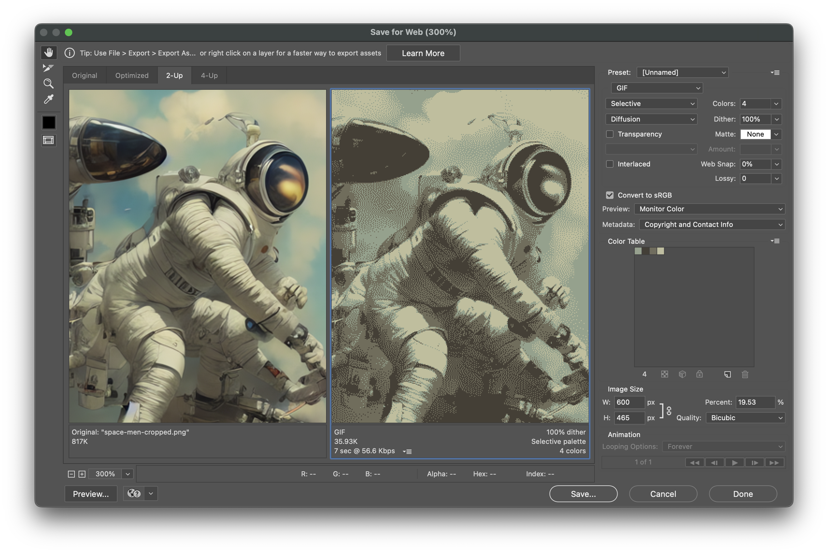
P.S. For one-off images, the tool of choice for creating the Status Hero look is — I’m very serious about this — Photoshop’s “save for web” dialog. 💅

P.P.S. All that dithering and shrinking and palette reduction makes for tiny web assets.

